Information infuses every aspect of today's society, from politics, to marketing, to education, to entertainment, to the environment. The National Council of Teachers of Mathematics (NCTM) Curriculum and Evaluation Standards for School Mathematics recognized in 1989 that understanding how to use this information in profitable and efficient ways would necessitate changes in the K-12 mathematics curriculum in the United States. As a consequence in that document and in Guidelines for Teaching Statistics K-12 (Burrill, 1991), the role of statistics in the secondary curriculum was defined. Since then, various attempts have been made to integrate statistics into the mathematics curriculum in the United States. These attempts range from curriculum materials developed by federally funded curriculum projects to individual efforts by local teachers, from the inclusion of a chapter on statistics by one text book publisher to the addition of one problem on statistics per chapter in another. The pieces are there - box plots, finding averages - but the overarching picture of what it means to educate students to be statistically literate is incomplete. In A Practical Approach to Teaching Statistics, Moore and McCabe list three statistical goals that are important for students to achieve in order to become productive citizens: Students `must learn how to read data, critically and with comprehension; ...must learn how to produce data that provides clear answers to important questions; and ... must learn sound methods for drawing trustworthy conclusions based on data.' (Moore et al., page xviii). The following discussion presents a way to think about the structure of the secondary statistics curriculum based on these three goals. Three parallel tracks, each focused on one of the goals, can be integrated with the traditional mathematics curriculum to ensure that all students receive a sound statistical education, as well as enhancing their understanding of mathematics.
Paraphrasing the last principle, real situations in which statistical concepts manifest themselves lead to an intertwining of content strands. Statistical content should be integrated in meaningful ways with other mathematics not taught as a separate subject. One method of designing the curriculum is to use data to drive some of the mathematics students must learn.
To become statistically literate, students must learn to resist the temptation to proceed immediately, without thinking, to do numerical calculations. The following problem (or a similar one particular to a country or region) can be given to students as an introduction to using variables and symbols in mathematics: In which state in the United States is it safest to drive? Students are asked to devise a procedure to answer the question, first for a small number of states. (Scheaffer, Burrill, Clifford, in press.)
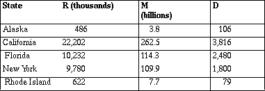
Suppose you are taking a trip that involves driving in five different states. How do these states rank in terms of traffic safety? The 1994 data on three variables for each state are in Table 1.
R = number of motor vehicle registrations,
M = vehicle miles of travel in the state,
D = motor vehicle deaths.
Table 1
Source: Statistical Abstract of the United States, 1993-94
a. How many registered motor vehicles did Florida have in 1994?
b. Did Rhode Island have fewer deaths than Alaska in 1994? Explain.
c. How do you think each of the measurements R, M and D were found?
d. Rank the states from best to worst in terms of traffic safety.
Explain the process you used and why you think it makes sense.
Part of the discussion centers around questions such as: What other variables might be involved? What other data would you find helpful? Are all of the data useful? As students think about part c, someone will raise the question: `How do you suppose they know how many miles people travel in a state?' Student answers include: they check the odometers on used cars; they look at the mileage when you take your car to emissions check; people report it on their tax statement (It is never quite clear who `they' is.)
Student solutions to the problem involve different configurations of decimals and units:
 and
and  .
.
For Alaska, they give 3.732 thousand registrations per death or 0.27 deaths per thousand registrations; 0.039 billion miles per death or 26 deaths per billion miles driven. Some use 39,000,000 miles driven per death. Students make tables and use spreadsheets to carry out their calculations. After the class has shared strategies and come to some agreement on a procedure, they download data for all of the states into their calculators or computer and answer the original question. Students build tables and use symbols (variables) in a natural way to describe their process to rank all fifty states, engaging in activities that lead to formal symbolism.
Table 2: Airline Complaints
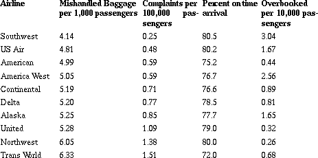
Air Travel Consumer Report, July, August, 1995
a. What other factors might you consider important when rating an airline?
b. Based on the data given, how would you rank the airlines? Be ready to justify your method.
c. Basaj ranked the airlines from 1 to 9 in each category, then found the average of the ranks.
What are the advantages and disadvantages of his method?
In this example (Witmer, Burrill, Burrill, Landwehr, in press), students again begin with a challenging problem that can be resolved using different but valid strategies. The data again raise questions: Are the differences in the numbers large enough to be significant? Can you combine the values? Why or why not? What is the difference in a percent and a rate? Are these the right data to use for the problem? Some students immediately select Southwest as the top airline because it has three firsts; ignoring the fact that it is tenth in the last category. Students usually discover the need for a mathematical process as they begin ranking all of the airlines. Some students decide to code the categories by ranking each airline from one to ten for each category.
Table 3: Airline Complaints in Rank order
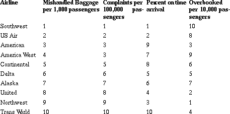
Coding leads to a discussion of what is lost or gained when data are transformed. In this case, it is the variability - the difference in percent on time arrival in America West and Continental is only 0.01% - which could be important when you consider rating on the basis of those ranks. Other students suggest using weighted values. For some students, losing your luggage is more important than being on time and they might create a formula like: R = OT + 5B + 2C + OB.
Note that in order to realize the full potential of the problem, it is necessary to have a discussion - interactive learning - where students reflect on each other's strategies, question, agree and disagree with one anther's work. The role of the teacher is critical to ensure that the mathematics and statistics inherent in the problem are raised and recognized.
The following is an example of one group's work on finding the volume of a book based on the measurements collected from each individual in a group.
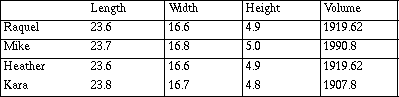
We would use 1919.62 as the volume because two of us got the same answer. Our volumes varied from 1990.8 to 1907.8 or about 83 cubic cm. The numbers are far apart because we measured a little bit different. (But only just by .1 or .2 cm. That doesn't seem right but we did our calculations again and it is.) Mike was off the most. If we would use the average mean it would be 1934.46 cubic cm. The average difference or standard deviation is about 28 cu. cm. Mike is what made the number so big.
The concern voiced by the group over the size of the error provides an opportunity to mathematically investigate how the error was formed: (V+ DV) = (L + xc6 DL)(W + xc6 DW)(H + xc6 DH). Students instinctively feel that the error xc6 V should equal the product (DL)(xc6 DV)(xc6 DW), but in fact the cross products produce their own error; LDL + LDH +... + L(DH)(xc6 DW) contribute to the total error. This experience provides a building block that helps students understand the expansion of a polynomial and what it means. The error can also be related to the geometric situation from which it developed.
It is important to remember the goals, reading data, critically and with comprehension, and drawing trustworthy conclusions based on data, underlie these lessons. The notion of making sense of information should permeate class discussion and activities. The mathematics and the statistics should both be prominent in the development, and the teacher has to help students sort out the critical components of both, helping students build on their informal understanding to more abstract mathematics.
Students can reinforce their understanding of mean by investigating the notion of center geometrically. They might consider questions such as: What is the center of a triangle? What is the center of population of a metropolitan or rural area? Where is the center of population for a given state? What does an `outlier' do to the center? How does the center of population relate to the geographic center? Students can find a population center using coordinates and geometric theorems and extend their knowledge of statistics as well as geometry. (Kranandonk, Witmer, in press)
The following data and student plots set up a situation where you need to compare data that are in very different units. Students use typical graphical and numerical tools but find them inappropriate and eventually develop a formula for z-scores as a method to `standardize' the two sets of data. Two national tests in mathematics, the Scholastic Assessment Test (SAT) and the exam from American College Testing (ACT), are administered by private companies to high school juniors and seniors in the United States. Scores on at least one of these tests are used to determine eligibility for entrance into most of the universities, and there has been concern among the public over the change in test scores since 1970. Table 4 shows the national average SAT and ACT mathematics scores from 1970 to 1989. Students are asked to compare these scores and describe how the averages changed over time (Scheaffer, Burrill, Clifford, in press).
Table 4: SAT/ACT Scores
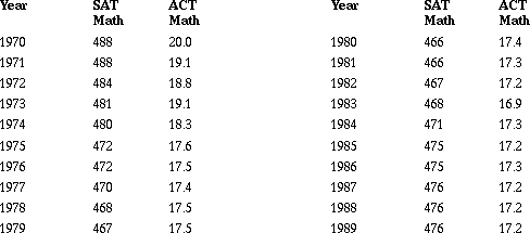
Source: American Almanac, 1994-1995.
a. What observations can you make by looking at the numbers?
b. Try to construct a plot that will allow you to compare the two sets of scores. What conclusions can you make?
c. Find the mean, the median and standard deviation for the SAT and ACT and describe what they tell you about the scores.
d. How do the numerical statistics you found above help you compare the ACT and the SAT?
Students find the formula for z-scores a useful procedure to help them answer the question. Plots over time allow them to observe that the SAT scores have made a greater improvement than ACT scores, although the SAT scores were relatively lower from 1976 to 1982.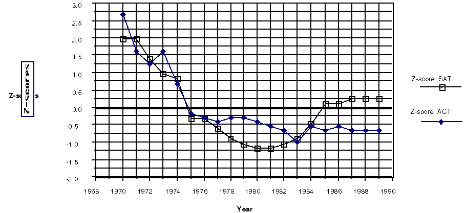
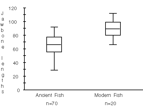
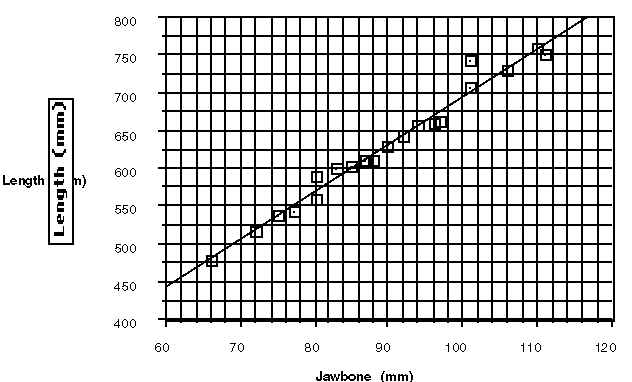
The following is another example of using statistical tools to compare data in a different kind of situation, still in an algebraic context. In the 1980's, remains of fish bones were found in a dry lake bed in Denmark. The fish supposedly lived in the lake about 3000 B.C. The lengths of 70 jawbones are given to students and the following questions posed: Were the sizes of the fish in the ancient lakes the same as the sizes of fish in modern lakes? Based on their jawbone size, about how long were the fish in the ancient lake? (De Lange, Roodhardt, Middleton, Burrill, Cole, in press). To answer the questions students are given the jawbone size and length of twenty fish from a nearby modern lake. In this instance, there is no common base such as year to anchor the comparison; the data sets have to be compared in a more global way. Students without much background in statistics or algebra often concentrate on numerical techniques. To answer the first question, they compare average jawbone sizes, and many neglect to account for variability. Some may find a percent difference between the extremes and the mean. Students discuss assumptions that have to be made in order to proceed: Were all of the bones from a lake that was drained or were they from fish that had been caught and eaten? Would this make a difference? How could you get a random sample of fish in a modern lake? To answer the question about the length, some students create an average ratio to predict the length of the ancient fish.
Students with a background in statistics and algebra might respond using a graphical representation such as box plots, which clearly demonstrate that the modern jawbones are much larger than the ancient ones.
A scatterplot and regression line, whether drawn by eye or using a regression model, can efficiently help students predict the lengths of ancient fish, based on some assumptions about similar shapes for the fish over the years. For some students, the fact that the grid displayed only fish with jawbones greater than 60 mm was a problem. Others quickly find and use an equation; for example, L = 63.2 +6.32J. 
A graph or diagram can be a model that helps students see patterns and relationships. In each of these cases, students focus on data, using a statistical framework but one embedded in the mathematics students encounter in secondary mathematics: variables, formulas, graphical representations.
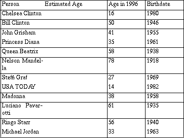
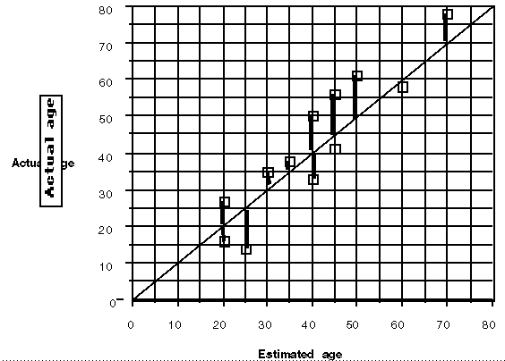
World Almanac, 1996
After students make an estimate of the ages and before they do any calculations, they plot (estimates, actual) and investigate the plot.
Do they, in general, overestimate or underestimate? How can they tell from the plot? Who is the best estimator in the group? In class? Using what criteria? Student strategies vary: some suggest the person with the most points on the line y = x or most points closest to the line.
Eventually a mathematical process to find the `error' in estimating emerges from the discussion. The mathematics that unfolds includes: using the line y = x line to determine inequalities; thinking about the vertical distance as the difference between the estimate and the actual; understanding the need for a method to remove the sign in calculating the differences, recognizing the impact of squaring an outlier.
The problem provides the statistical background for understanding a residual and how the sum of squared residuals can help describe the effectiveness of a particular relationship between data pairs. Students reach this understanding after experimenting with a variety of strategies and discussing the consequences of each.
Table 5: Airplane Operating Cost
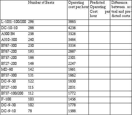
Source: Air Transport Association of America
At the informal level, students each draw an `eyeball' line through the data and answer a question similar to that in estimating ages: Who has drawn a line that seems to make the best predictions? Again, discussion among students produces several strategies; the same number of points above the line as below, the line that goes through the most points.
Students usually quickly move to finding the difference between what they know to be true for the cost of plane with a given number of seats and what the line tells them. They find individual differences (`I beat you on three planes!') (`The B757 has 188 seats, and my line says it will cost about $2,500 an hour. The actual cost is about $2,300 so I am off by about $200.')
Initially students make their predictions from the graph but soon recognize the usefulness of a table or spreadsheet as a way to quickly produce all of the differences. In order to do this, they must find an equation for their line or `mathematicize' the situation. For the line above, an equation using the points (175, 2500) and (300, 4000) to predict the new cost in terms of the old could be C = 2500 + 12(S - 175). The cost of operating an airplane with 175 seats was $2500 per hour, and each new seat increased the cost by $12 per hour. Students should have experiences interpreting their equations in terms of the numbers and symbols and explaining slope with respect to the data.
Students investigate questions such as: How close does your line predict? Overall, can you improve your predictions? Whose line seems to do the best job of predicting? Will the model predict well for an airplane with 400 seats? In doing so, students relate the geometry of the situation to their numerical analysis; looking carefully at the residuals as vertical distances and thinking about the possible effect of an outlier on their conclusions as well as how they can find some way to measure the overall error in their predictions. As students move from the informal to more formal understanding of a regression line, they can begin to use software that produces regression models and concentrate on understanding what makes a model appropriate and how to interpret a given model.
A formal development of the least squares regression line can be related to the study of quadratics. By choosing a fixed point for a line and experimenting with slopes, students discover the quadratic relationship for (slope, sum of squared differences). (The mean of both variables is one logical choice.) By using their knowledge of parabolas, students find the vertex of the parabola and so determine the slope that minimizes the sum of squared differences (ibid, in press). Other regression lines, such as a median fit regression line, can be introduced to find equations that will not be affected by outliers. An important mathematical concept here is to encourage students to think about the rate of change: Is it constant? What does the rate of change tell you about the relationship between the variables?
The relation between mathematics and statistical skills is solidified as students continue their study of mathematics. Correlation is one of the tools in the curve fitting process, a way to measure the degree of the linear association between the variables. Correlation can be done intuitively from looking at plots, then formalized by either deriving the correlation coefficient r using a geometric approach or vectors; or by deriving r2 as the percent of the response variable that can be explained by knowing the independent variable.
Students can investigate situations such as the following: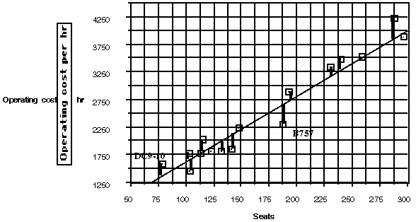
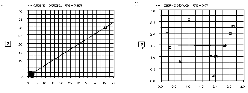
For each of the plots I to IV, comment on the relation between the correlation coefficient, the plot,
the mean y-value, and the least squares regression line.
As students continue to investigate the modeling theme, transforming data, studying residuals and correlation, they are engaged in thinking about multiplicative relationships and how to manage them. Logarithms become invaluable tools. Matrices and vectors can be used to develop multiple regression techniques. Students can learn to read data critically by using mathematics in real applications and to draw meaningful conclusions about problem situations. The link between mathematics and statistics will help them understand both content strands.
They are instructed as follows:
a. Look at the sheet of rectangles and write down what you think will be the average area of the rectangles.
b. Select five rectangles you think are typical, find the area of each and find the average area.
c. Use a random process to select five rectangles, find the area of each and find the average area.
Number line plots obtained from the results of one class are below.
Guess:
x
x x
x x x x x
x x x x x x x x
| x |x |x x |x x |x x | x |x | | | | x |
4 6 8 10 12 14 16 18 20 22 24 26
Subjective Sample:
x
x
x x x
x x x x x x x
| | |x xx x x|x x x |x x x x | x x |x | | | | |
4 6 8 10 12 14 16 18 20 22 24 26
Random Sample:
x x x
x x x xx x x x
| x x x x|x x x x|x x x x | x x x | |x | | | | | |
4 6 8 10 12 14 16 18 20 22 24 26
The actual mean is around 7.4. The teacher can actually have a small interval estimate ahead of time that is written down on a sheet of paper and given to someone to read after the class results are recorded. Students should recognize that guessing and subjectively selecting a sample does not produce much useful information. The power of random sampling is that the distribution will form a basic pattern and based on this knowledge you can make a probability statement about the outcome, a statement that will be true a certain percent of the time.
Students can be introduced to random sampling through classroom experiences. Homework can be collected from a random sample of students every day. If students keep track of how many times they were chosen and then compile class results before a marking period, they will begin to have a feeling for how random sampling behaves. Students should come to understand that when an event is random, the outcome of a single individual is unpredictable, but there is a definite pattern in the long run. They will also see that streaks and repetitions are not unusual in random samples.
Experimental design, where the experimenter controls the environment as opposed to a survey where the surveyor takes what is given, has traditionally not been considered part of the mathematics curriculum. One approach is to integrate across disciplines and have problems presented jointly by the mathematics instructor and a science or social science teacher.
The basic principles of designing an experiment - deciding on the treatments, controlling factors, avoiding confounding where the effect of two or more variables is indistinguishable, the need for randomization in designing the experiment, should be a part of the instruction. Students can read and discuss classic experiments such as the whether aspirin helps prevent heart attacks found in issues of Science magazine, publications of the American Statistical Association, or statistics textbooks. Again, they can use media descriptions of experiments from areas such as consumer reports or medical research.
The study of probability will help students see the patterns formed by studying random events. The power of statistics is in the study of inference, `...formal methods to draw conclusions from evidence based on properly produced data.' (Moore et al., 1989. page xviii). Probability - and not the probability that focuses on combinations and permutations - is the link between data and inference, the language that is used to describe the reliability of conclusions made through inference.
Students will learn to reason from probability distributions and to make statements about populations based on samples, to recognize when a sample outcome is unusual, to decide whether two means are equal or if an outcome is really different from what was expected.
The study of probability functions is critical and deserves to be built into the curriculum in a role similar to that of trigonometric functions or polynomial functions as a way to reason and make conclusions about unknown situations based on information and to use this information to make predictions and decisions about situations in the work place, in health care, in government and in the daily lives of people. The approach taken in the Contemporary Mathematics in Context series suggests a framework for thinking in this way. The materials, for the last four years of secondary school, treat statistics and probability as separate strands merging in year three and four in the study of sampling and inference. The probability strand has strong links to the statistics strand, with heavy emphasis on simulations and graphical representations of sampling distributions.
The integration of these three goals as parallel components of the secondary mathematics curriculum will provide the statistical background necessary for schools to produce literate graduates. It will also provide a different applications component for mathematics and allow students the opportunity to understand how mathematics can and must begin to interface with other disciplines to make sense out of the continually increasing amount of information.
Burrill, G., and Hopfensperger, P. (in press). Exploring Linear Relations . Palo Alto, CA.: Dale Seymour Publications.
Burrill, G. (ed.) (1991). Guidelines for the Teaching of Statistics K-12 Mathematics Curriculum. Palo Alto, CA.: Dale Seymour Publications.
Burrill, J., Clifford, M., and Landwehr, J. (in press). Mathematical Modeling using Data and Logarithms. Palo Alto, CA.: Dale Seymour Publications.
Clifford, M., Sherrick, K., Mastermateo, M., O'Connor, V., Kranandonk, H., and Errthum, E. (in press). Mathematics in a World of Data. Palo Alto, CA.: Dale Seymour Publications.
de Lange, J. (1987). Mathematics, Insight and Meaning. Utrecht: OW&OC, Utrecht University.
de Lange, J., Roodhardt, A., Middleton, J., Burrill, G., and Cole, B. (in press). Digging Numbers. In National Center for Research in Mathematical Sciences Education and Freudenthal Institute (Eds.), Mathematics in Context: A connected curriculum for Grades 5-8. Chicago, IL.: Encyclopedia Britannica Educational Corporation.
Freedman, D., Pisani, R., and Purves, R. (1980). Statistics. New York, NY.: W.W. Norton & Company, Inc.
Hirsch, C., Coxford, A., Fey, J., Schoen, H., Burrill, G., Hart, E., and Watkins, A. (in press) Contemporary Mathematics in Context. Dedham, MA.: Janson Publishing Company.
Moore, D. (1985). Statistics, Concepts and Controversies. New York, NY.: W.H. Freeman and Company.
Moore, D., and McCabe, G. (1989). Introduction to the Practice of Statistics. New York, NY.: W.H. Freeman and Company: xvii-xviii.
National Council of Teachers of Mathematics. (1989). Curriculum and Evaluation Standards for School Mathematics. Reston VA: The Council.
National Council of Teachers of Mathematics. (1991). Professional Teaching Standards for School Mathematics. Reston VA: The Council.
Scheaffer, R., Burrill, G., and Clifford, M. (in press). Exploring Symbols : An Introduction to Expressions and Functions.. Palo Alto, CA.: Dale Seymour Publications.
Scheaffer, R., Errthum, E., Mastermateo, M., and O'Connor, V. (in press). Projects: Planning and Conducting Surveys and Experiments . Palo Alto, CA.: Dale Seymour Publications.
Witmer, J., Burrill, G., Burrill, J., and Landwehr, J. (in press). Advanced Modeling using Matrices. Palo Alto, CA.: Dale Seymour Publications.
Witmer, J., and Kranandonk, H. (in press). Exploring Centers. Palo Alto, CA.: Dale Seymour Publications.
Generated with CERN WebMaker